Original Image

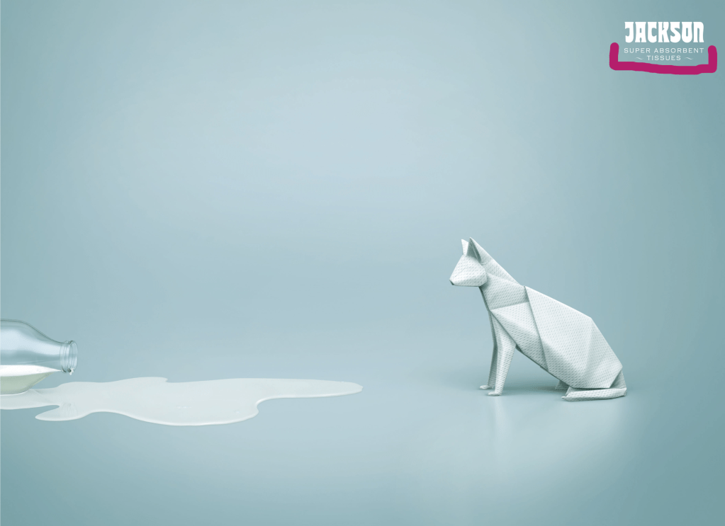
This is an advertisement for Jackson Super Absorbent Tissues and it was created by FCB Ulka. As described on Paintbox.In, the design was created digitally, however, mock-ups were made using real tissues to try and mimic the way that the tissues would look if they were folded up. The advertisement is appealing in its simple design and its use of origami as a jump-off point.
Proximity
 The only text in the Jackson Tissues ad is in the upper right-hand corner. Because of the decision to use such a small amount of text, it is important that the text be placed closely together in a way that shows that the text is all related. In this ad, the text contains the name of the brand as well as the name of the product. As both the brand name and the product name are important to ensure the consumer is able to quickly identify what is being advertised, it is also important that they be placed together. Had the text been separated, it would be more difficult for the viewer to identify whether “Jackson” is a brand name, an artist name, or some other identifier.
Alignment
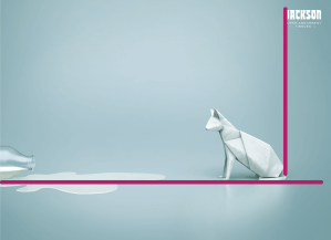 The only text in the Jackson Tissues ad is in the upper right-hand corner. Because of the decision to use such a small amount of text, it is important that the text be placed closely together in a way that shows that the text is all related. In this ad, the text contains the name of the brand as well as the name of the product. As both the brand name and the product name are important to ensure the consumer is able to quickly identify what is being advertised, it is also important that they be placed together. Had the text been separated, it would be more difficult for the viewer to identify whether “Jackson” is a brand name, an artist name, or some other identifier.
Repetition
 This advertisement shows repetition throughout in the form of repeating the off-white color in all aspects. This repetition brings the entirety of the piece together and causes the four main aspects of the piece to feel unified in message.
Contrast
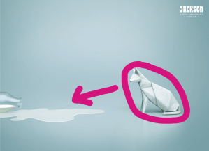 In this piece, the tissue cat is in contrast to the rest of the piece and the fact that it appears to be looking toward the spilled milk draws attention to the overall message which is that tissue paper (whether in cat form or not) soaks up spills!
Color
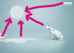
 This advertisement does not have much color in it relative to other pieces. This is not to say that the off-white coupled with the shades of light-blue are not beautiful; they are. However, the lack of diversity of color in this advertisement forces the viewer to look at, and think about the elements themselves rather than allowing themselves to be distracted by additional stimulation.
An important aspect of the colors within the piece that causes the viewer to direct their attention to the center is the gradient effect between the light blue and darker blues. As the center shows the lightest color blues, the viewer inherently knows that this is where their attention should be drawn.
Conclusion
All of the above features, proximity, alignment, repetition, contrast, and color, contribute to the overall appeal of this advertisement. It is memorable, unique, and thought provoking and, while simple in design, it is bound to stick with the viewer for longer than other, less imaginative designs.
